A Quick and Easy Guide to Banner Design

So we’ve all heard by now that “banner blindness” is a real problem in online marketing these days. All those startling statistics about how you’re more likely to get struck by lightning than get clicks on a banner, how someone can spend several minutes on a page and still not see your ad, how it’s just a waste of time and money, etc. all seem to overlook one important fact: When done right, banners still work.
That’s right. Website banners can still be effective and capture user attention, and spur them to action, but you have to design them in such a way that they don’t feel spammy and that they feel natural and relevant to the users. Otherwise, your ad could fall into the abyss of the ignored — but we don’t want that to happen.
So how do you design effective banners? How do you make them feel fresh and modern while still capturing user attention and spurring them to click? The trick is to focus more on your brand and your message and less on flashy gimmicks designed to grab attention.
Keep It Simple
The number one rule for attention-getting banners? Keep it simple. Cluttered banners that are packed with information — plus rainbows, GIFS, flashing text, and everything else you can think of — are the fastest way to turn off your audience.
Instead, focus on a clean and simple design that sticks to a single message and call to action, is consistent with your brand, and uses animation sparingly. Saturating your banner with facts and information, colors, images, and animation is only going to be overwhelming, so focus on a simple, powerful ad and save the details for the landing page.
Follow Convention
Over the years, banner designers have tried a number of tricks to get user attention. Sometimes, they work. More often than not, though, they aren’t very successful at anything other than annoying users. While thinking outside of the box and being creative is important, do so within certain boundaries of convention.
For example, stick to a standard size and shape (728 pixels by 90 pixels for banners at the top or bottom of the page, 300 by 250 pixel medium rectangles for ads in the right side column or embedded in text elements, 300 by 600 pixels for half page banners, and 320 by 100 pixels for mobile banners.
Other conventions you should adhere to?
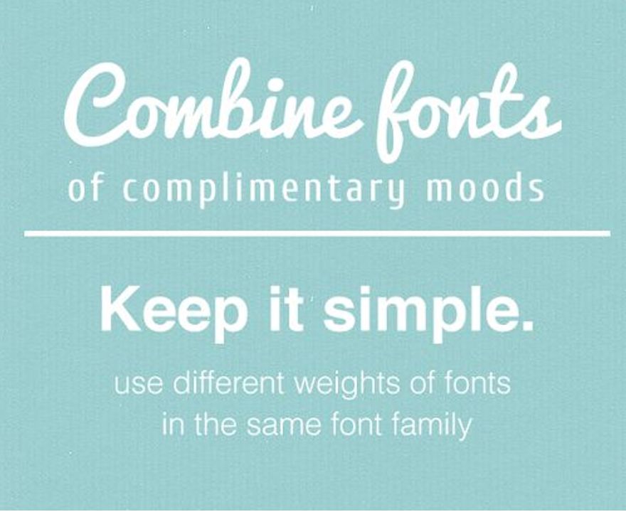
Use no more than two fonts per ad. Bolder choices are better for headlines, while simple sans-serif fonts are ideal for the remainder of the text. Don’t use more than two font sizes in the text, or use one size and bold some text for emphasis. In short, don’t fall victim to “font vomit” and use 6 different fonts in 10 sizes. Your ad will look cluttered.

Choose standard colors. Typically, blue, green, and yellow combinations get the best responses, while red is the least successful color. That’s not to say that you shouldn’t use other colors, but do some research into color theory before you design your ads, and choose hues that are known to be effective.
Use HTML5, not Flash. We cannot emphasize it enough: Flash is dead by all means, so stick to the new technology instead.
Be cognizant of where your banners lead on click-through. Make sure that the landing page reflects the same style and tone of the banner, and that it coincides with the call to action. Users shouldn’t have to – and won’t – search for the offer they responded to.
Use Animation Correctly

While flashing headlines and animated GIFS are in general a no-no when it comes to banners, adding animation can be an effective means of capturing attention. When you add animation, it should enhance the banner, capturing attention or adding emphasis, not annoying the user.
Don’t allow your animation to detract from the message, but instead, ad it as a little “surprise” that gets the user to take a second look and see what your ad is all about. With a simple free animation maker, you can easily enhance your banners with animations, keeping them fresh and capturing attention.
One caveat to remember when using animation, though: You want to make sure that you can still save the banner in as small of a file size as possible, so as to avoid bogging down the page loading speed, or not having your banner load at all. Again, this is one reason to avoid using Flash, since it tends to create larger file sizes. Compress your files to make them as small as possible so they don’t interfere with the user experience.
Make the Call to Action Clear
Finally, be sure that it’s clear what you want users to do as a result of clicking on your ad — and how that action benefits them. Not only should banners be user-benefit focused, but they should also make the call to action clear. Use language like “click here,” “submit,” “get yours” or other action-oriented directives to spur people to action.

Banner blindness can be a problem, but when you focus on making your banner ads attractive and fresh, it doesn’t have to be for your company. Design your ads to be simple and uncluttered, attention-getting, and clear, and you will get results.


